Turning a GLP-1 prescription into a habit people actually keep
Redesigning the SkinnyRx app and rebuilding the purchase funnels - growing conversion while staying inside strict medical compliance.
About
One product, four surfaces
SkinnyRx is a US telehealth platform that gives eligible adults access to GLP-1 weight-loss medication (semaglutide & tirzepatide) fully online - eligibility, prescription, clinical chat and delivery, with no clinic visit.
I worked across the whole surface: the patient mobile app, the patient web portal, the clinician / admin side, and the marketing site & purchase funnels. My focus was the moment that decides the business - turning a first-time visitor into a qualified, paying, and retained patient - without ever crossing a compliance line.
In production, SkinnyRx now serves 50,000+ patients and holds a 4.8 Trustpilot rating across 5,000+ reviews.
Role
Product Designer (lead)
Scope
App · Portal · Admin · Funnels
Domain
Telehealth / DTC
Focus
Conversion · Retention · Compliance
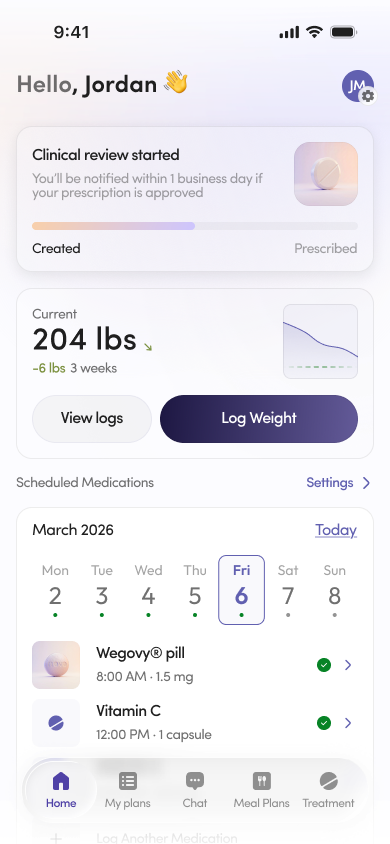
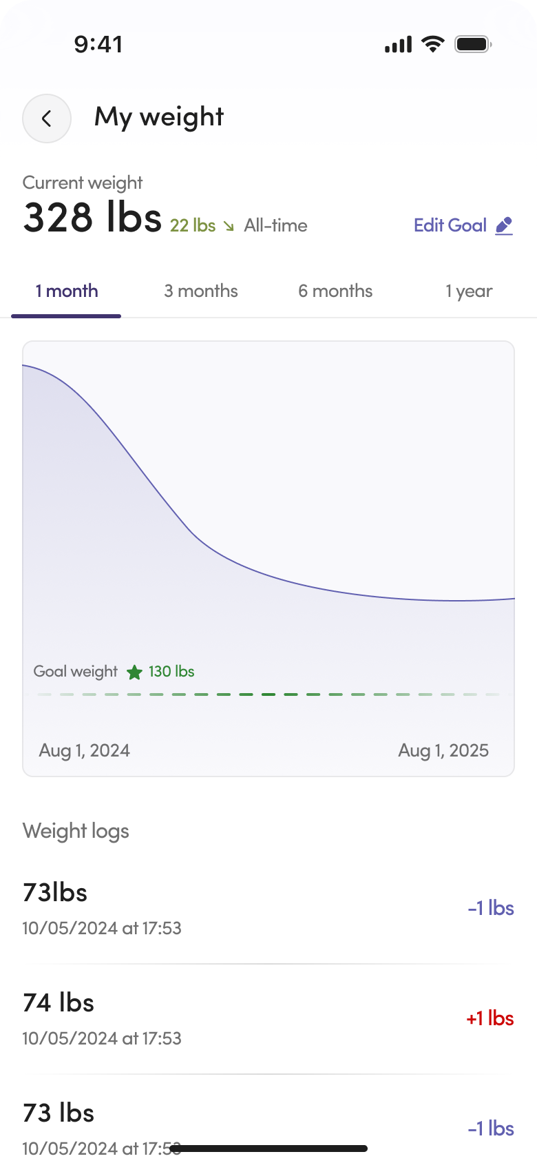
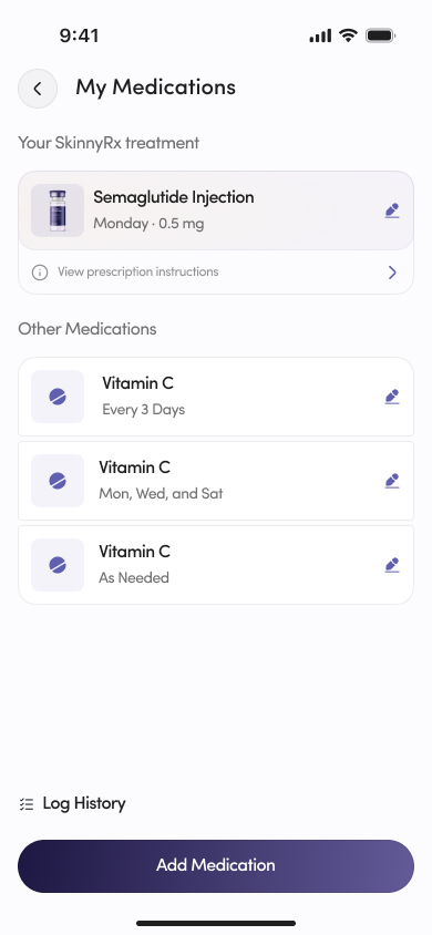
The shipped app - a five-tab experience: Home, My Plans, Chat, Meal Plans, Treatment.
The problem
Conversion, retention and compliance pull in different directions
Growth wanted the shortest possible path to purchase. Medicine and legal required the opposite - no one can be sold a prescription drug before an eligibility intake. And retention only happens if people actually stay on their protocol after the first order.
The design job wasn't to pick a winner. It was to hold those three forces together instead of trading one for another.
Process
How the work ran
01
Discovery
Product & legal
02
Research
Onboarding & freemium
03
Funnel tests
Multiple routes
04
Freemium
Free value layer
05
UI & system
App · portal · admin
Research
What we learned about onboarding & freemium
We ran user interviews, session reviews and onboarding drop-off analysis to understand where first-time users hesitated. Two patterns stood out:
- People dropped on the long medical intake when it felt like an interrogation with no visible payoff.
- People who saw a personalized plan and price early were far more likely to finish that same intake.
So we reframed onboarding around momentum: show tailored value fast, ask medical questions in context, and always explain why each question is needed.
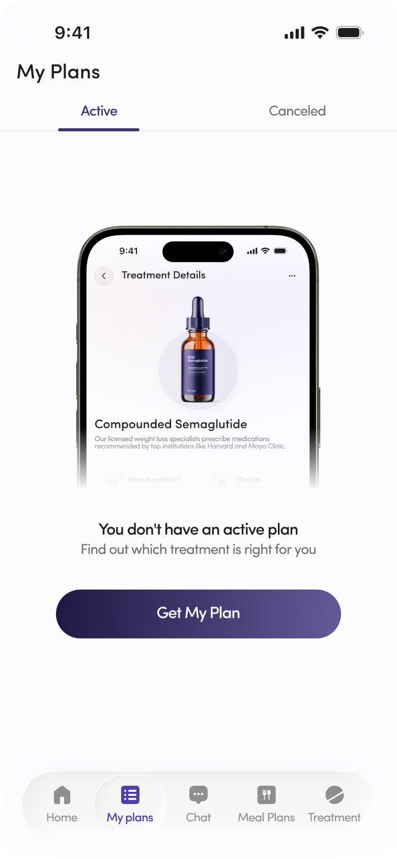
Show the plan and price early - then ask the medical questions in context.
Funnel experiments
Two ways into the same prescription
Instead of one funnel, we tested fundamentally different routes to purchase - and measured qualified conversion, not just clicks.
The compliant classic
Eligibility quiz → personalized plan & price → checkout. Higher-quality leads and a clean compliance story, but heavier drop-off at the top.
The affiliate route
Paid / affiliate traffic lands on a product page → immediate checkout → medical intake completed after purchase, eligibility verified before anything ships, automatic refund if not eligible.
Funnel B converted far better at checkout - but it created a strange new state: a paid customer who isn't yet a patient. That was the real design problem.
I designed patterns to make "pay before you qualify" feel safe and clearly reversible: an explicit "your order is held until a clinician approves you," an honest refund guarantee up front, and an intake that now felt like unlocking something already paid for - which lifted intake completion instead of tanking it.
01
Product page
Affiliate lands, sees offer + refund promise
02
Checkout
Pays - order marked "held"
03
Intake
Framed as unlocking the order
04
Clinician review
Approve → ship · or refund
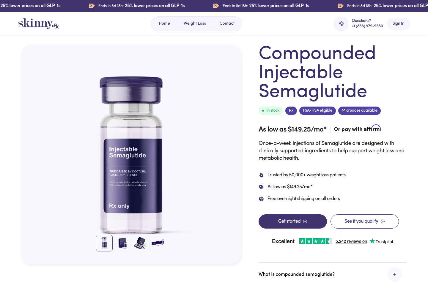
The product page is the buy-first entry: clear price, social proof and a single “Get started” - intake comes right after.
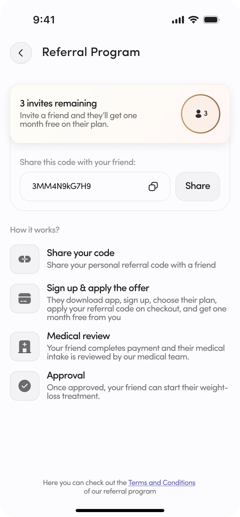
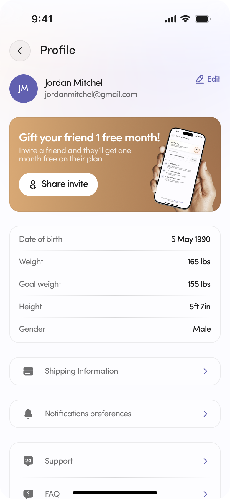
The referral / affiliate route, shipped: a friend pays first, then their medical intake is reviewed before anything ships.
Freemium
Free value before the paywall
We designed a freemium layer so users get real utility before and around the paid medication - progress tracking, personalized meal plans, medication reminders, and clinical chat.
It gave hesitant users a reason to stay engaged, gave the brand a retention surface beyond the prescription itself, and created a natural, non-pushy moment to upgrade.
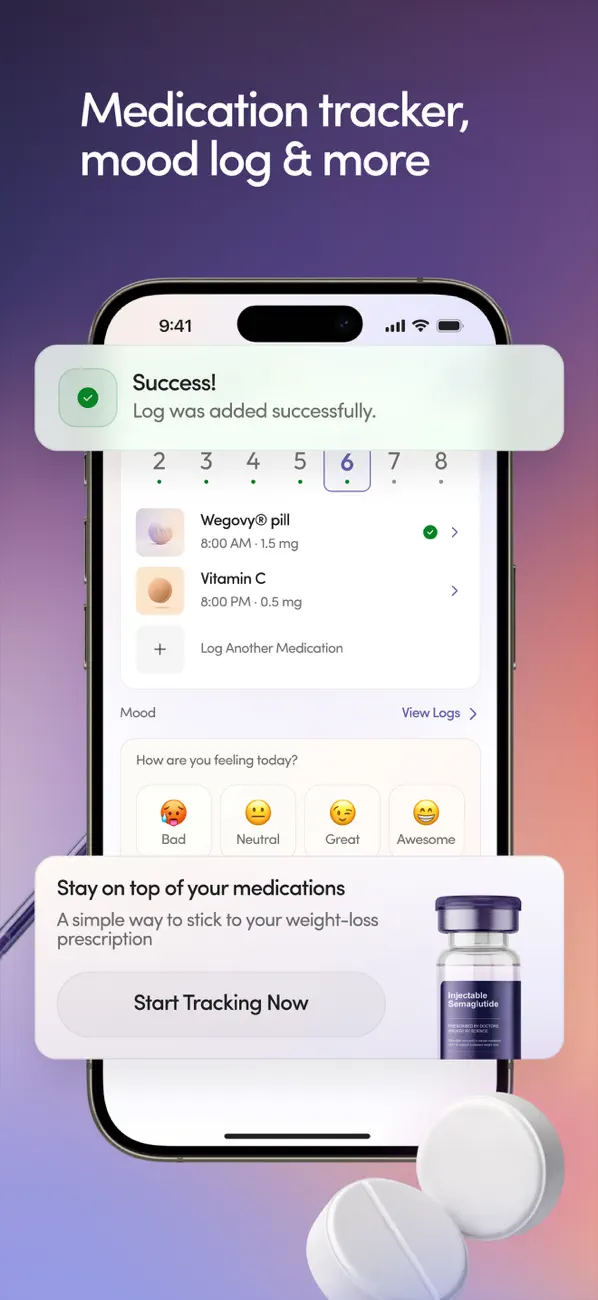
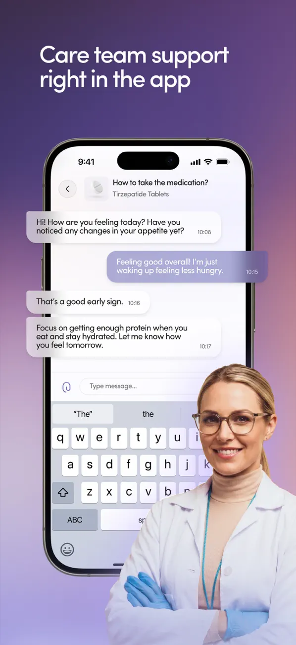
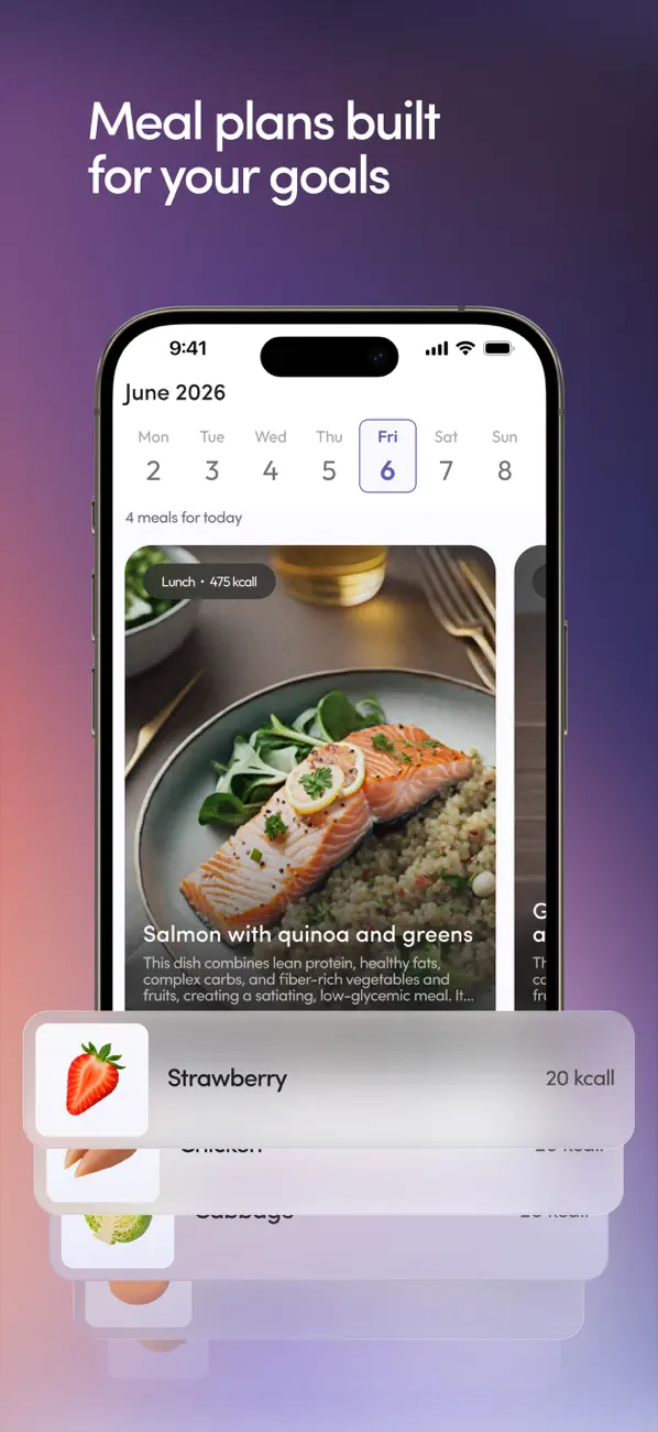
Free value around the prescription - tracking, mood logging, clinical chat and meal plans.
Compliance by design
The rules were part of the canvas
Every screen lived inside medical and legal constraints - and they shaped the UI as much as any user need.
Intake is mandatory
No path to medication can bypass eligibility - in any funnel, including buy-first.
Claims are regulated
We couldn't promise outcomes or use certain before/after language - copy had to be careful and truthful.
State-by-state rules
Some states require a live telehealth visit before prescribing - the flow adapts by location.
Compounded-medication disclosure
Clear, unavoidable disclaimers that compounded formulations aren't FDA-approved finished products.
Auditable decisions
The clinician / admin side needed a clean, reviewable record of every eligibility decision.
Result
Outcome
Reframing onboarding around momentum, designing a safe buy-first funnel, and adding a freemium value layer moved the numbers that mattered - purchase conversion and how many patients stuck around after the first order.
+34%
Checkout → purchase conversion
1.8×
Intake completion rate
+22%
90-day retention
Want the full walkthrough?