
DRINKSTAR · Product Case
An events layer for bars and restaurants: organize a hangout, invite friends, earn points toward real discounts at the venue. I led UX/UI and rebuilt the design system it shipped on.
Purpose
Hangout - a feature for organizing meetups at bars and restaurants. Users invite friends, discover new venues, and earn points redeemable for real discounts at the places they visit.
Tests & methodology
Scenarios: Creating a hangout · Joining an existing hangout
Other work
Design system: I rebuilt the component base from scratch - see below.
Documentation: Wrote the component docs myself so devs wouldn't have to ask.
Dev handoff: Ran the process for getting UI-kit components into the dev kit, with the team.
Goal
Get people organizing meetups at bars instead of just talking about it online - and give venues a reason to be found by people who weren't already looking for them.
Objectives
- An interface for organizing a meetup that doesn't feel like filling out a form.
- A reason to invite people you haven't met yet, not just your existing group chat.
- A way for venues to get discovered through the events happening inside them, not just search.
The problem
Most social plans stayed online - people talked about meeting up more than they actually did. Bars had the opposite problem: limited visibility to anyone who wasn't already a regular. The gap between the two was the actual design brief.
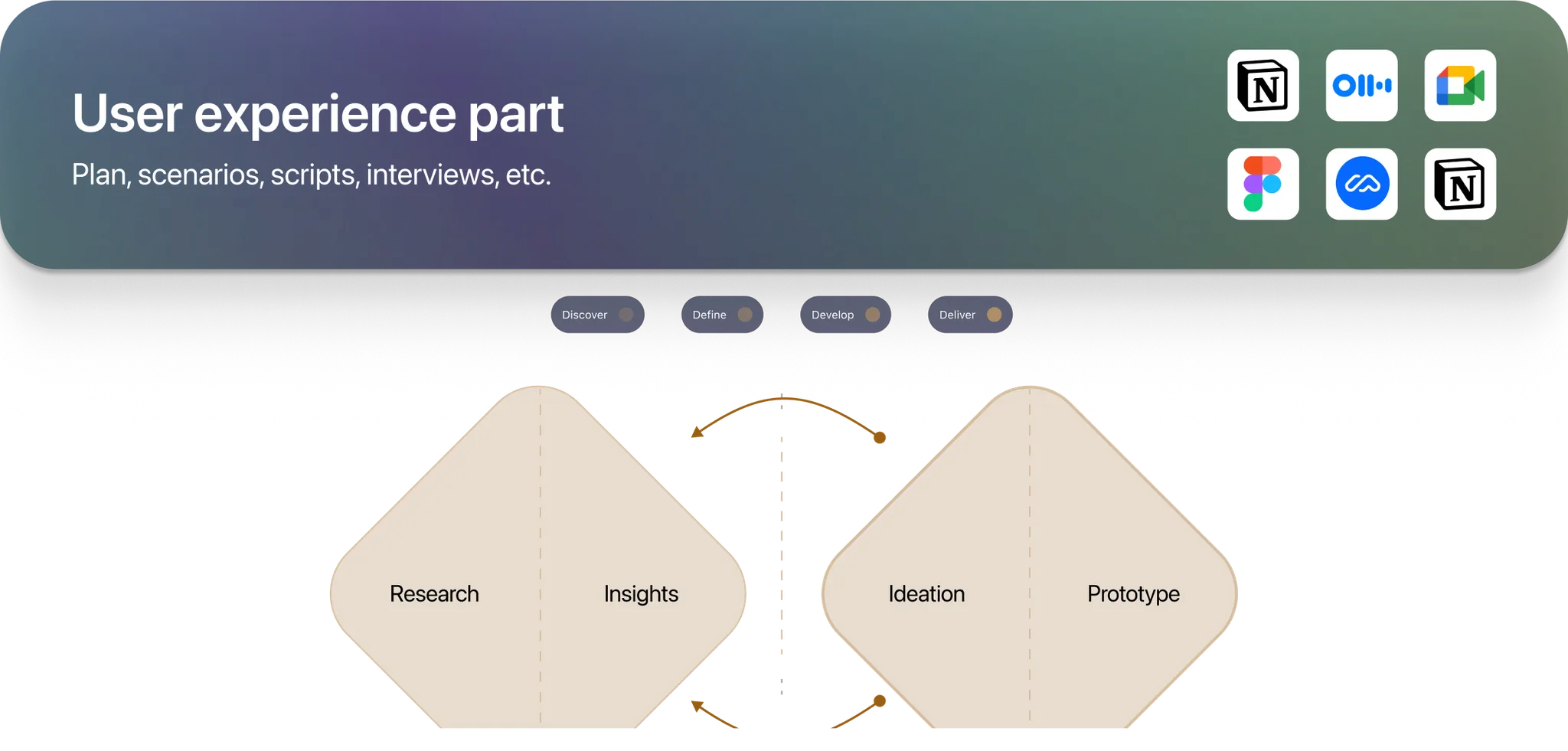
Usage Scenarios
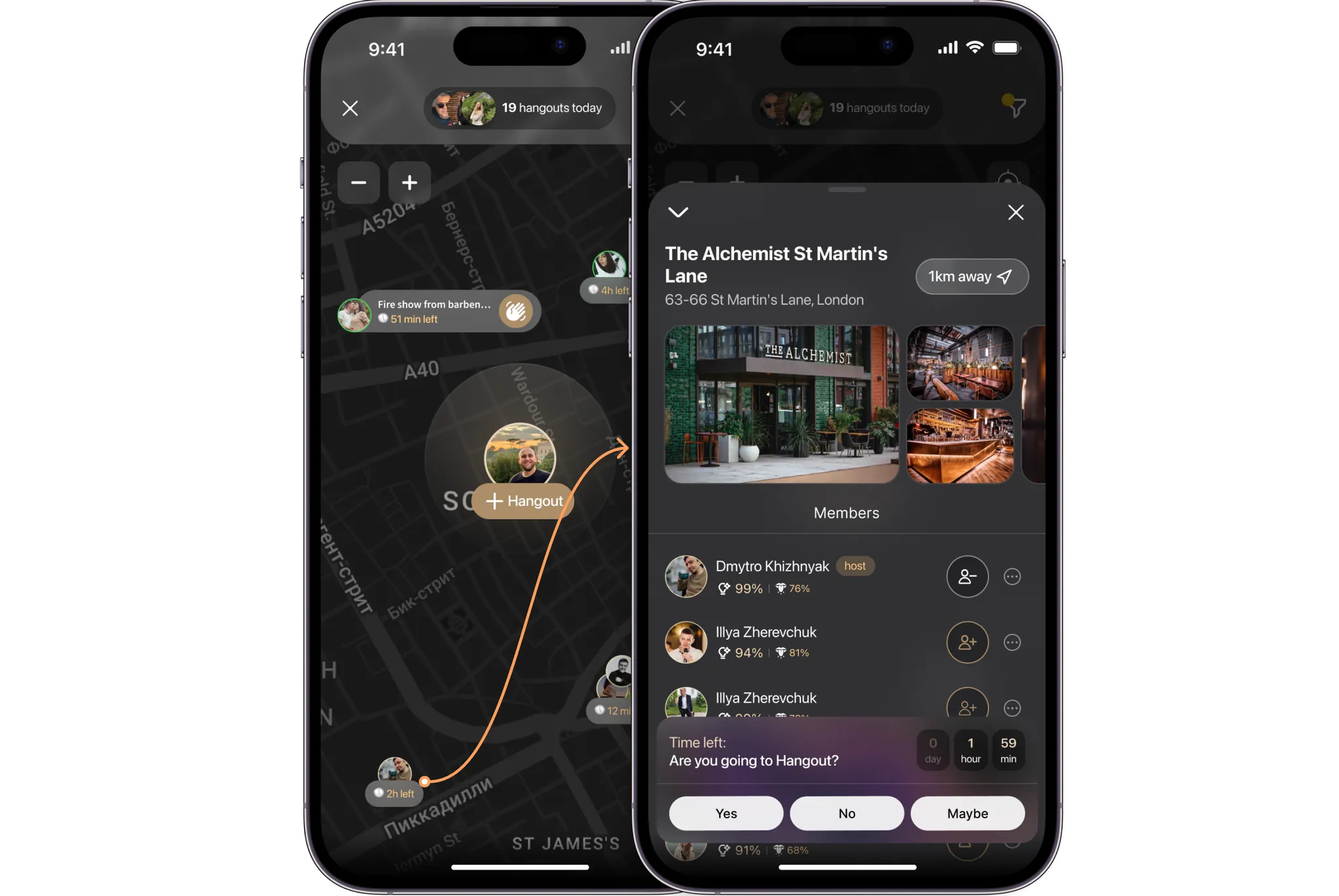
The user searches for events in their city and joins those that align with their interests.
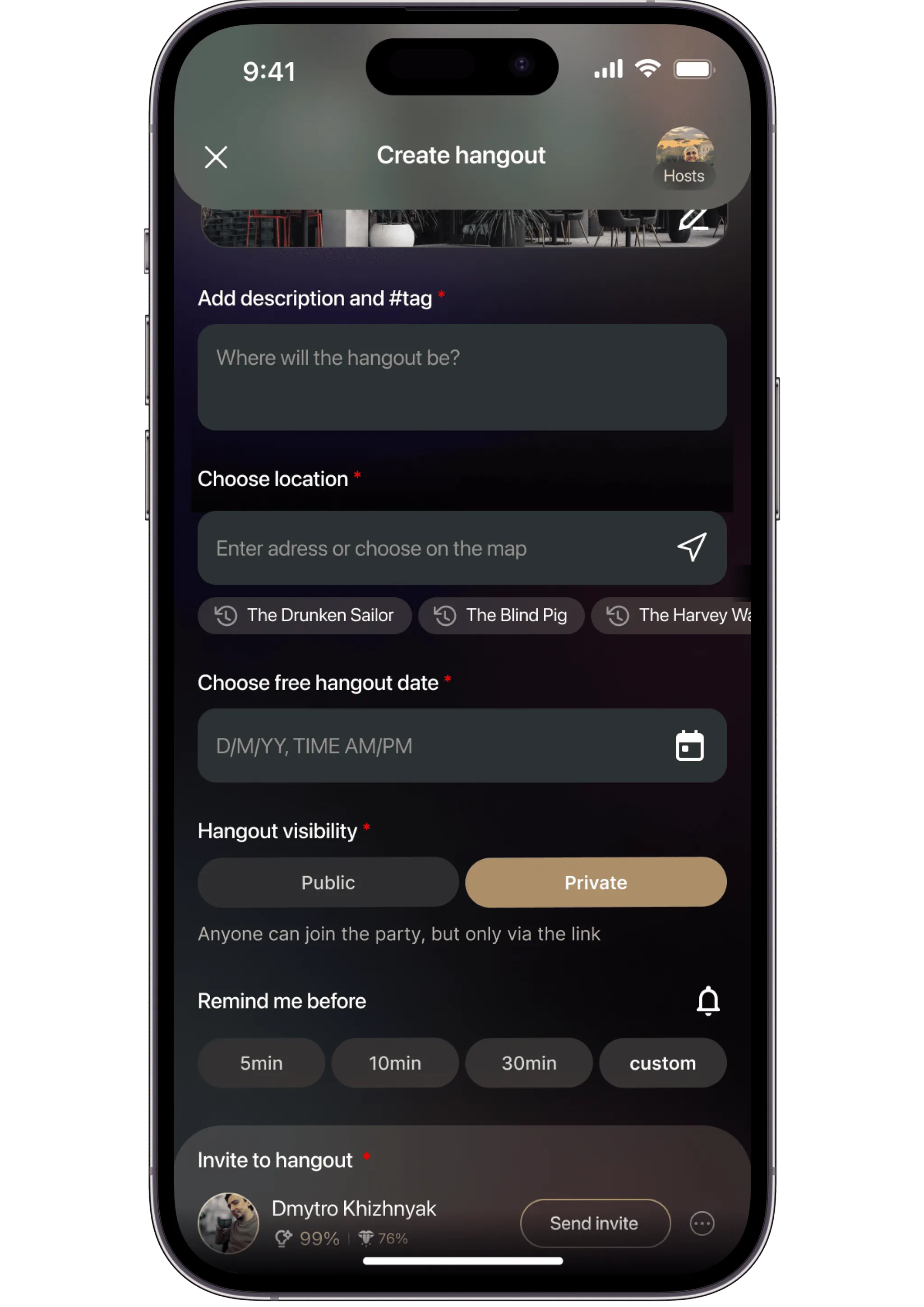
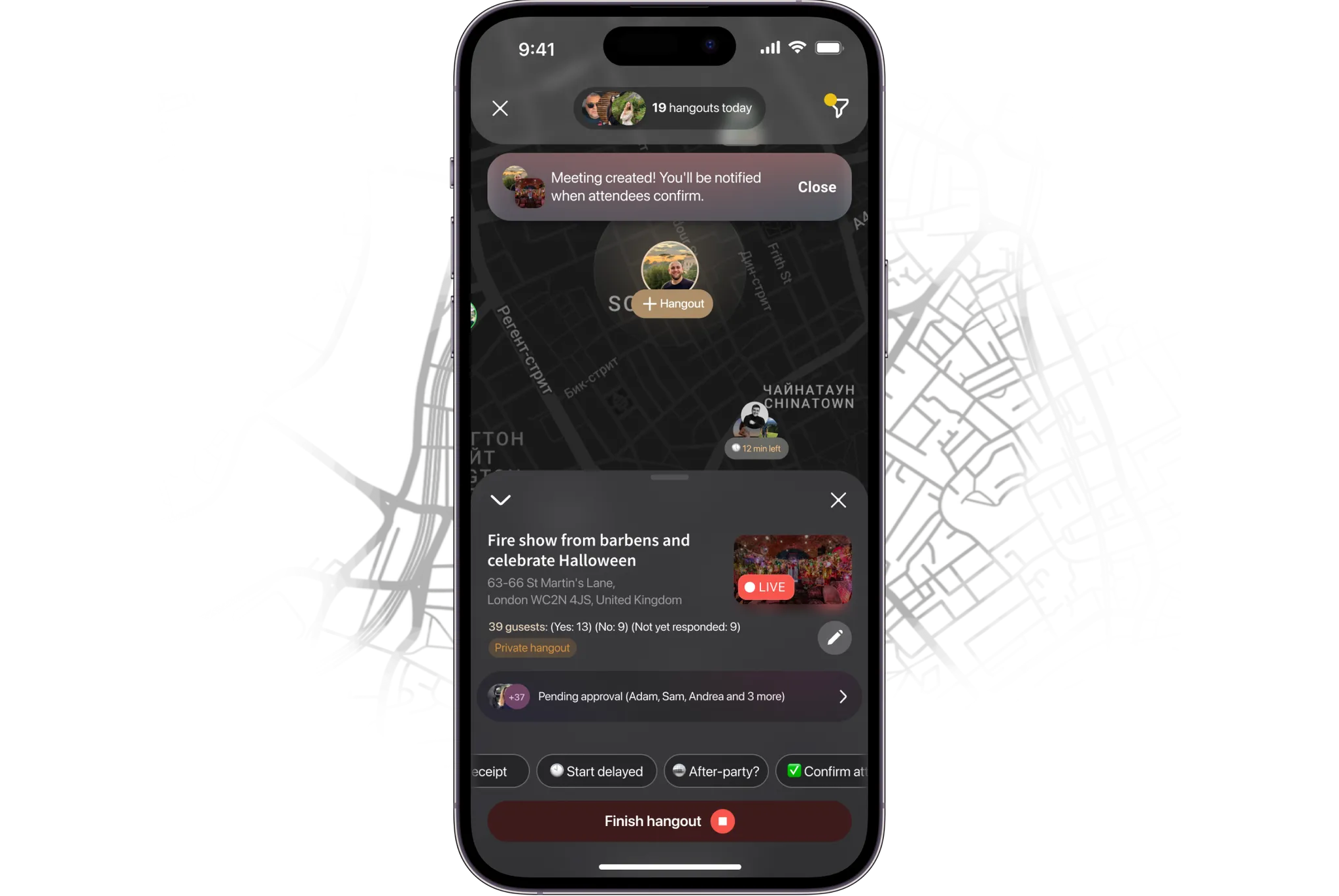
The user creates an event, selects a bar, invites friends, and opens it up for others to join.
The user browses a list of bars based on recommendations from other users, ratings, and event locations.
Script Writing for Respondents
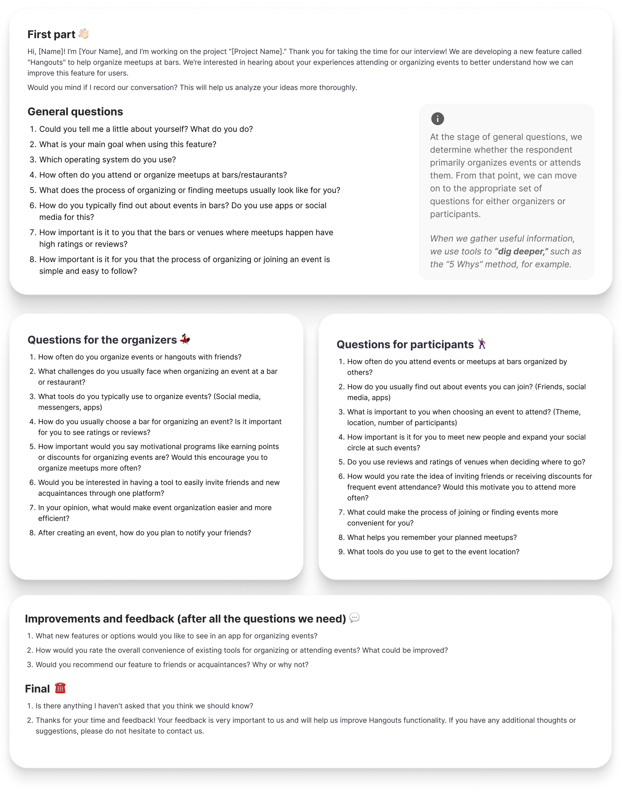
I wrote the interview script around open-ended questions only - anything closed-ended just confirms what you already assumed. Four topics: event organization, bar selection, social interactions, motivation.
Interview
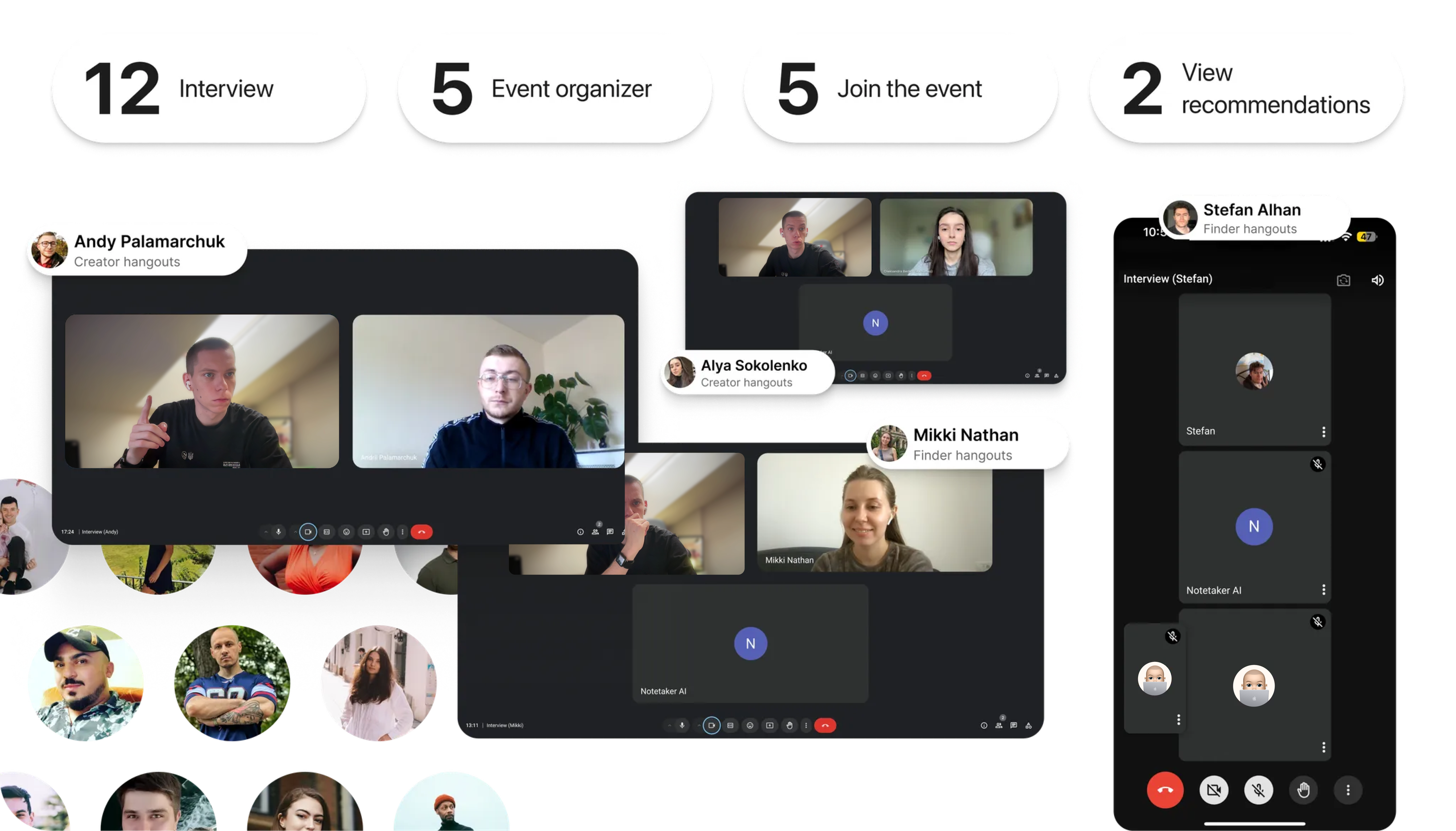
30-40 minutes each, over Google Meet, with a note-taker running so I could stay in the conversation instead of typing. Same shape every time: explain what's happening, work the script and follow anything worth following, leave room at the end for whatever the respondent brought up unprompted.
Transcription
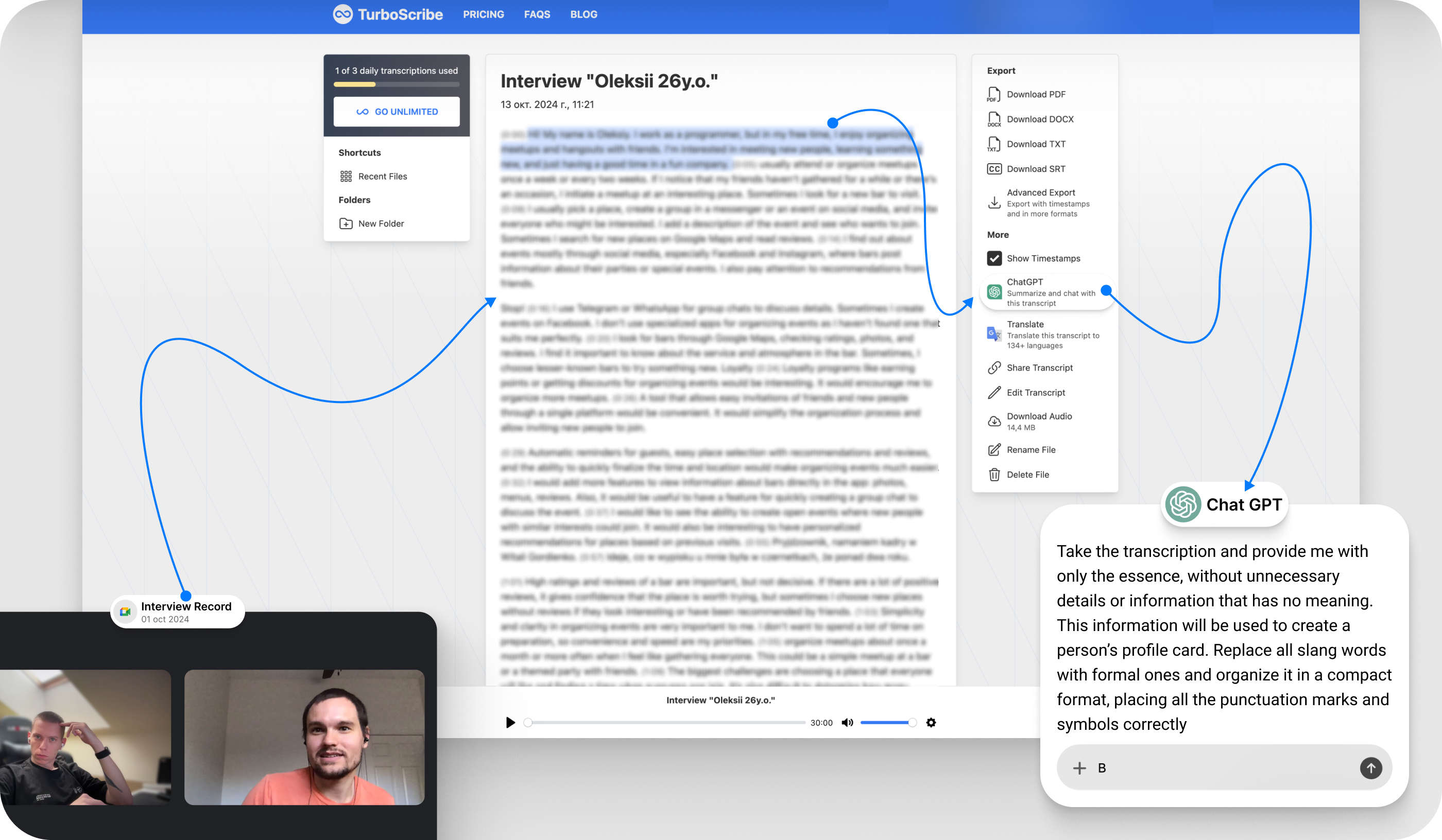
Otter.ai for the first pass, then a manual re-read against the note-taker's notes - automated transcription alone misses tone and the things people only imply. Everything got grouped by topic afterward.
Persona Creation
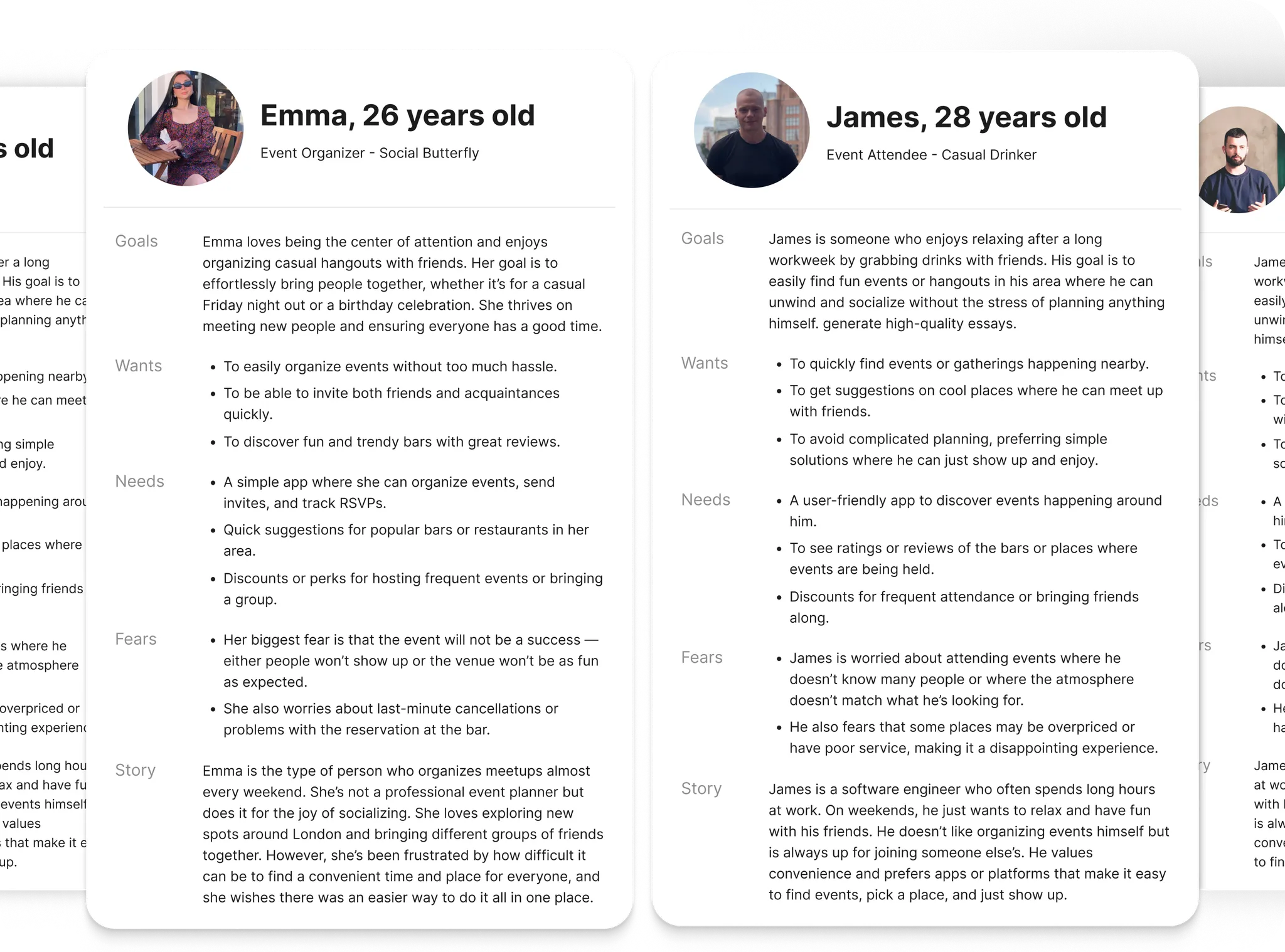
Two clear groups fell out of the interviews: people who organize events, and people who only ever join them. Each got a persona and a journey map, which is what actually decided what to prioritize - not a hunch.
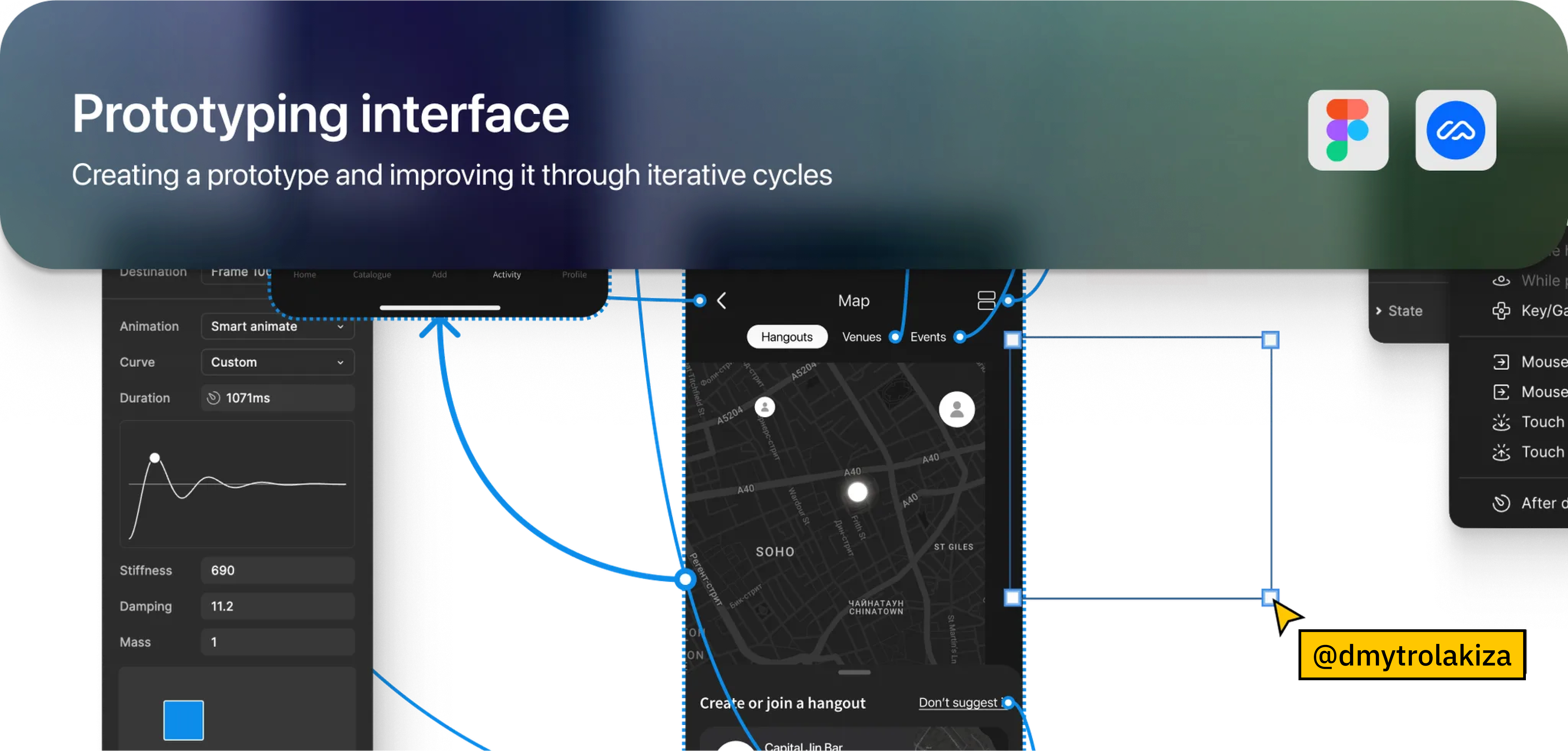
Planning & Prototype Goals
Testing would track time-to-complete, click count, and completion rate against three questions: can people create and manage an event without guidance, how easily do they find and invite others, and where does the bar-discovery flow actually lose people.
Creating Low-Fidelity Prototypes
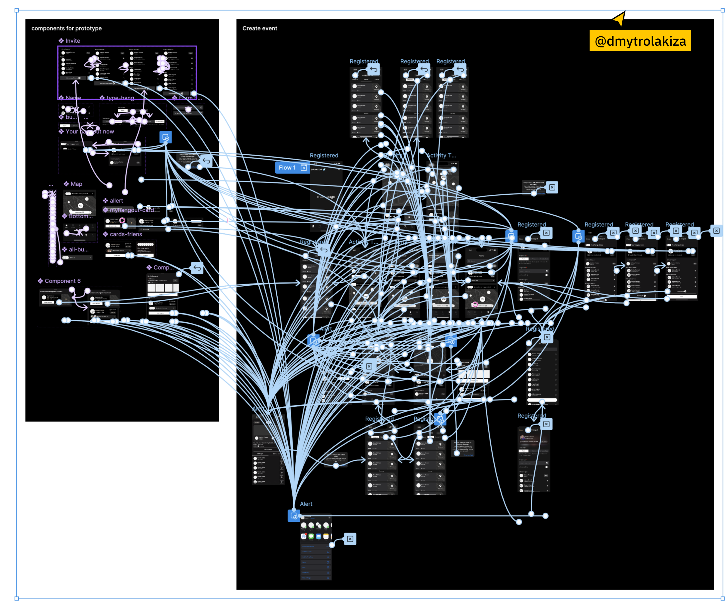
Grey boxes and placeholder text in Figma, deliberately undressed - four screens (main, event creation, event details, bar browsing) built to test navigation, not to look finished. Polish this early just hides whether the flow itself works.
Maze Testing
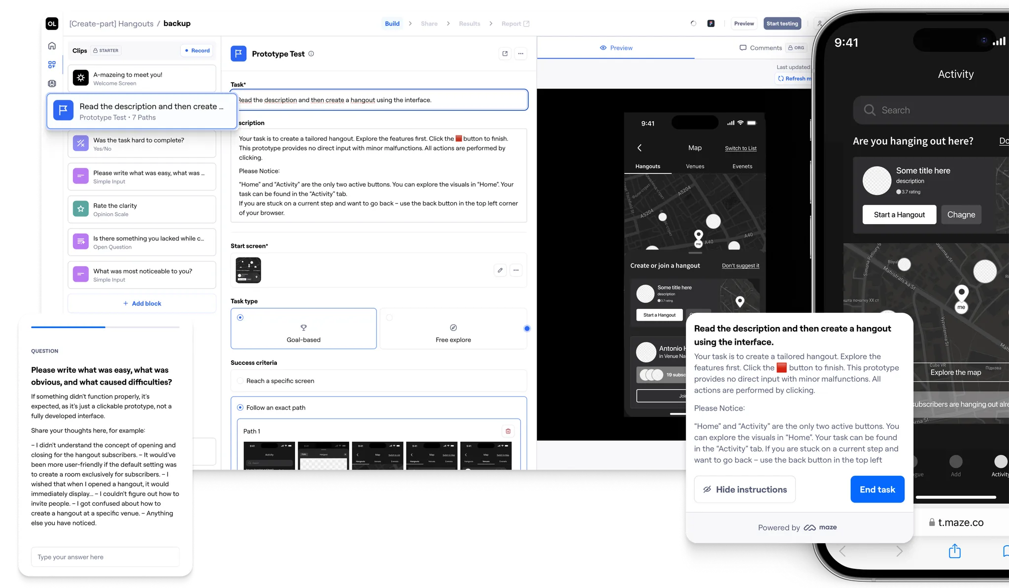
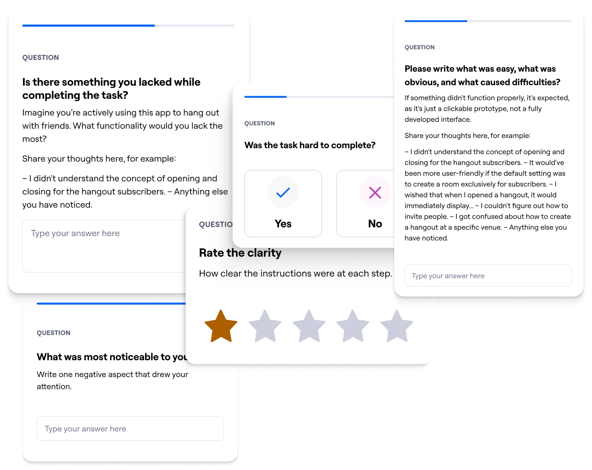
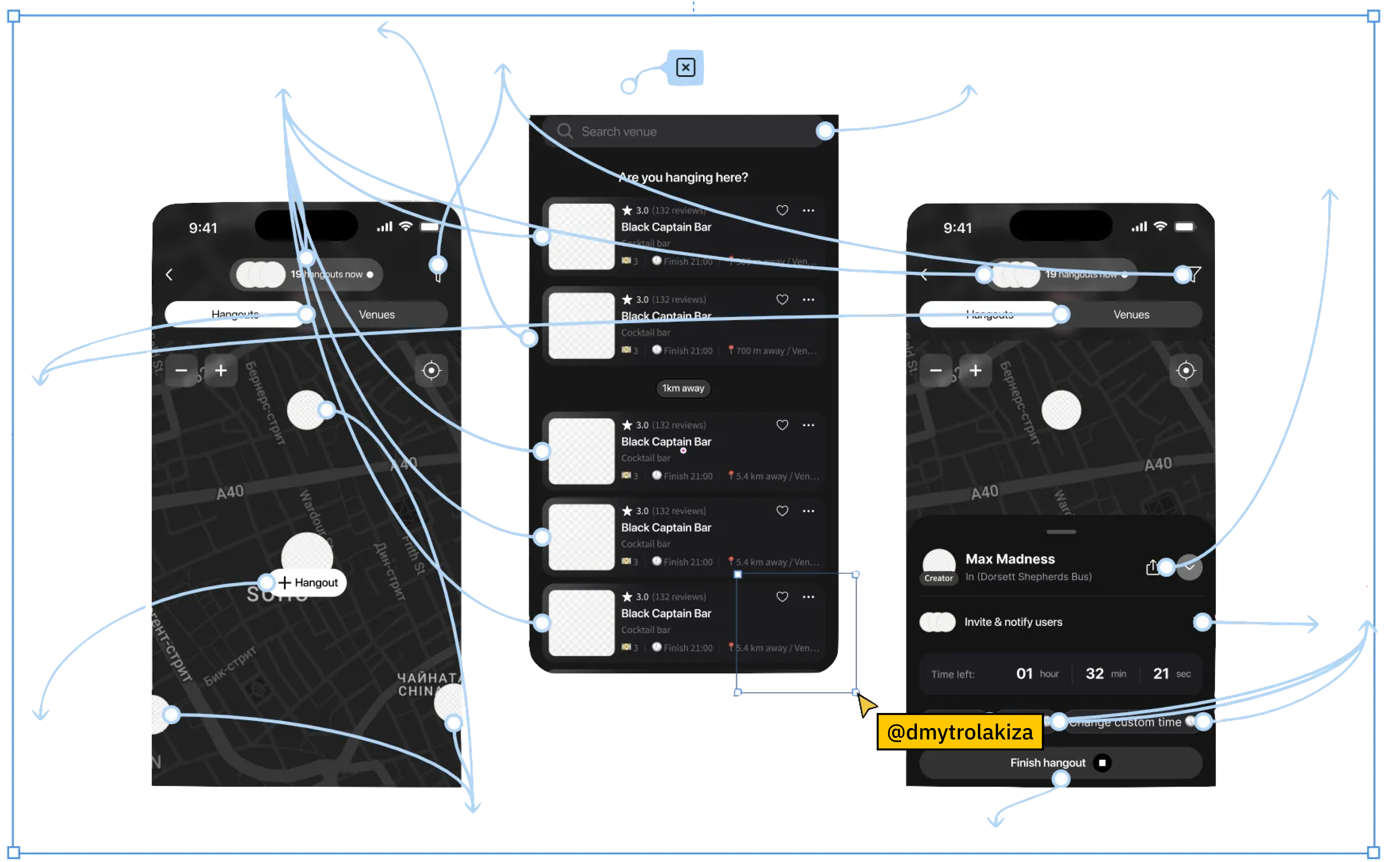
The clickable Figma prototype went into Maze with three tracked tasks:
- Create an event and invite friends: success = reaching "Create Event".
- Join an existing event: success = tapping the right target to join.
- Choose a bar for the event: watching how people actually picked from the list, not just whether they finished.
Maze logged time and click count per task; I varied the open-ended follow-up questions between sessions so the results weren't just people echoing each other's phrasing back.
Test Results & Iteration
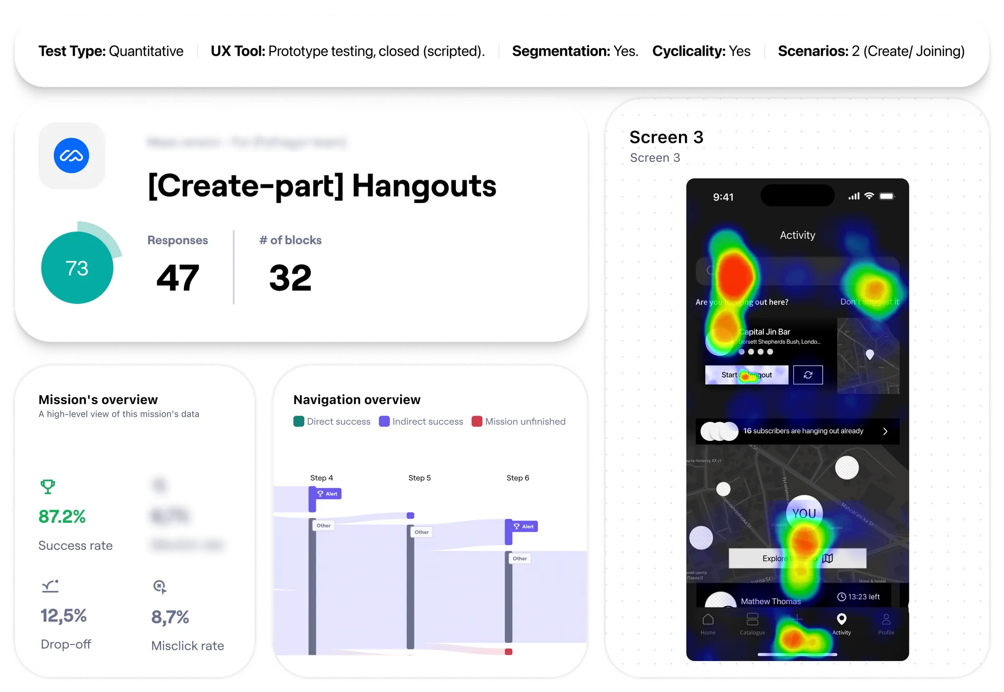
The report surfaced gaps I hadn't planned for going in - not just confirmation of what the team already suspected. The first round of low-fi prototypes wasn't good enough on a couple of the tested flows, so those went back for another pass before the design moved on.
The testing gave us enough confidence to stop prototyping and start building the MVP - scoped to the core loop only, so we could get it in front of real users faster.
Reworking the Design System
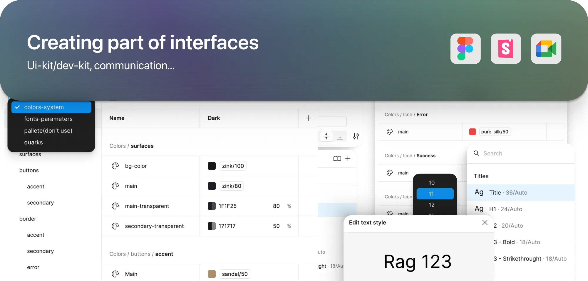
The existing system was the actual bottleneck, not the UI. Components were over-layered, naming was inconsistent enough that nobody could guess what anything was called, and every small change meant fighting the file before you could even start on the design.

The obvious fix was to drop it and adopt Chakra UI or Ant Design instead. I put the trade-off to the client directly: a ready-made library ships faster today but locks the product into someone else's visual defaults, right as the brand was still finding its own. They chose to keep ownership of the system and rebuild it properly instead of trading it away for speed.
Reworking Components Gradually, Step by Step
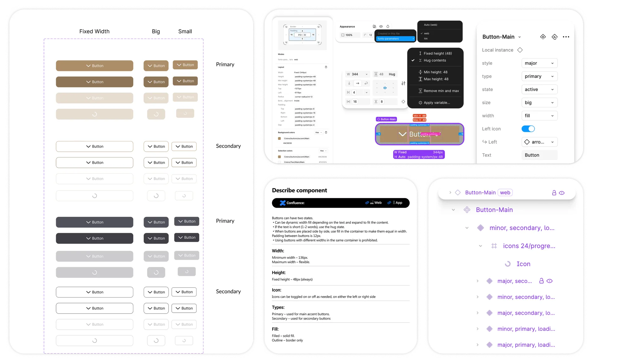
Replacing everything at once would have meant weeks with no working file. Instead I went component by component, starting with the worst offenders - stripping unnecessary layers, rebuilding each as proper atoms, testing it in isolation before moving to the next.
Baby steps, one component at a time, each one verified before touching the next - slower, but nothing broke on the way.
Implementing Design Tokens
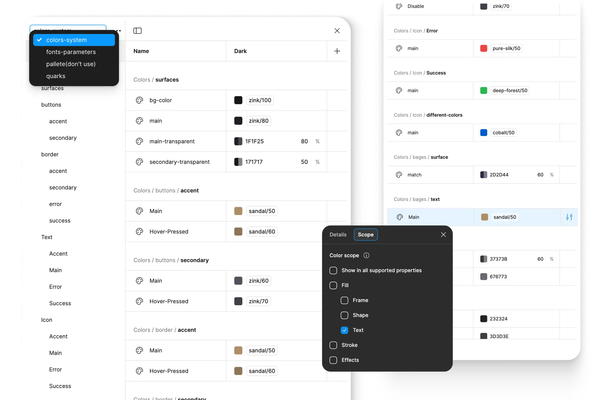
Every component got light and dark variants built on paired tokens (primary-color-light / primary-color-dark) instead of one-off overrides, so switching themes is a token swap, not a redesign.
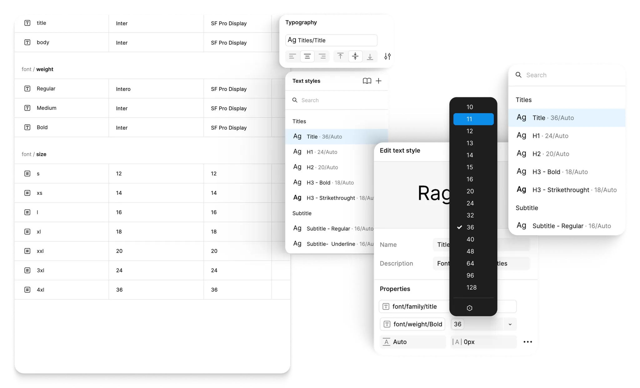
Same idea for type: font variables in Figma meant the iOS and web versions could diverge on typeface without maintaining two separate component sets.
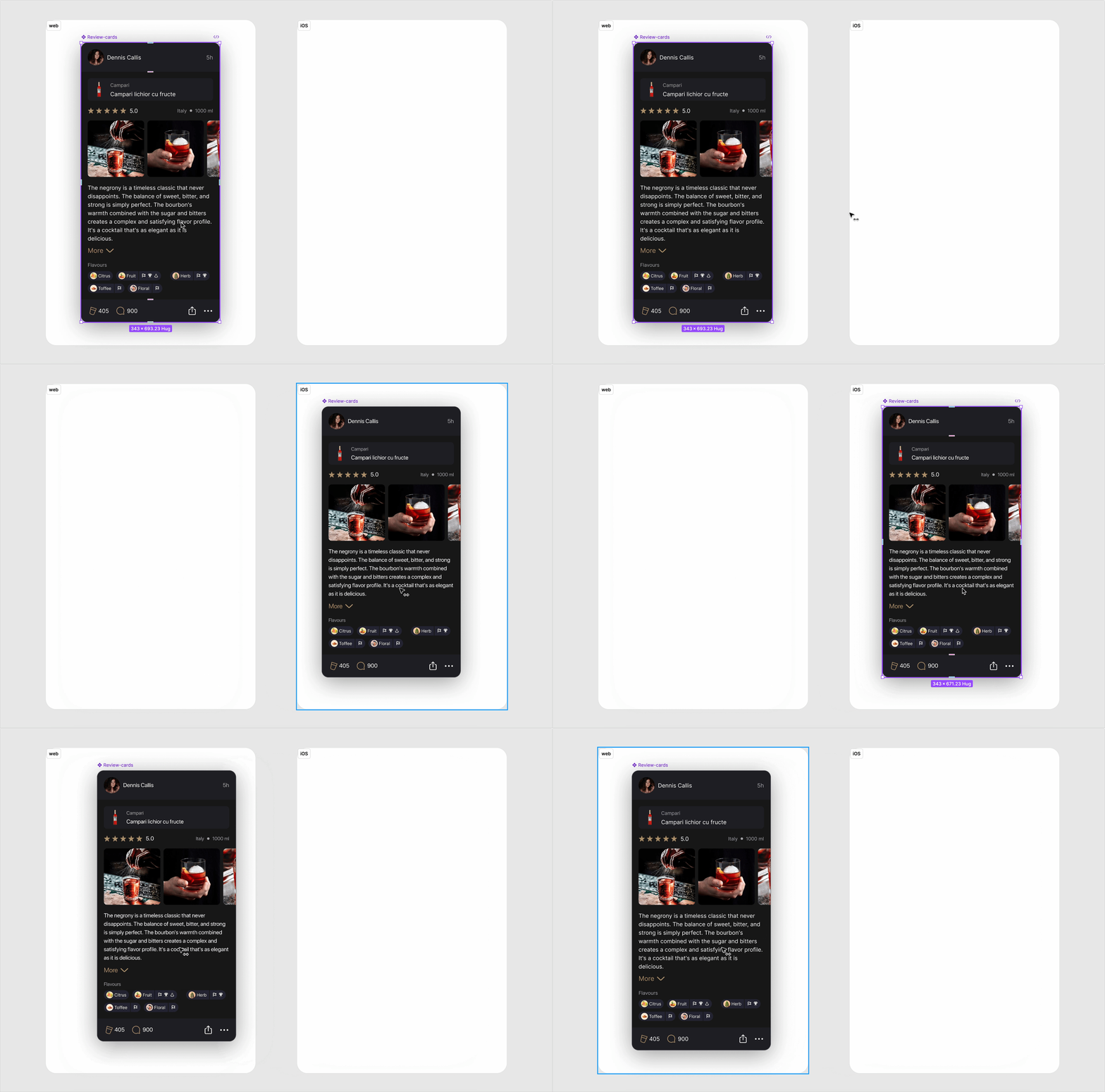
Color, font, or spacing changes went from a file-wide hunt to a token swap - seconds instead of hours.
Optimization of Structure in Figma
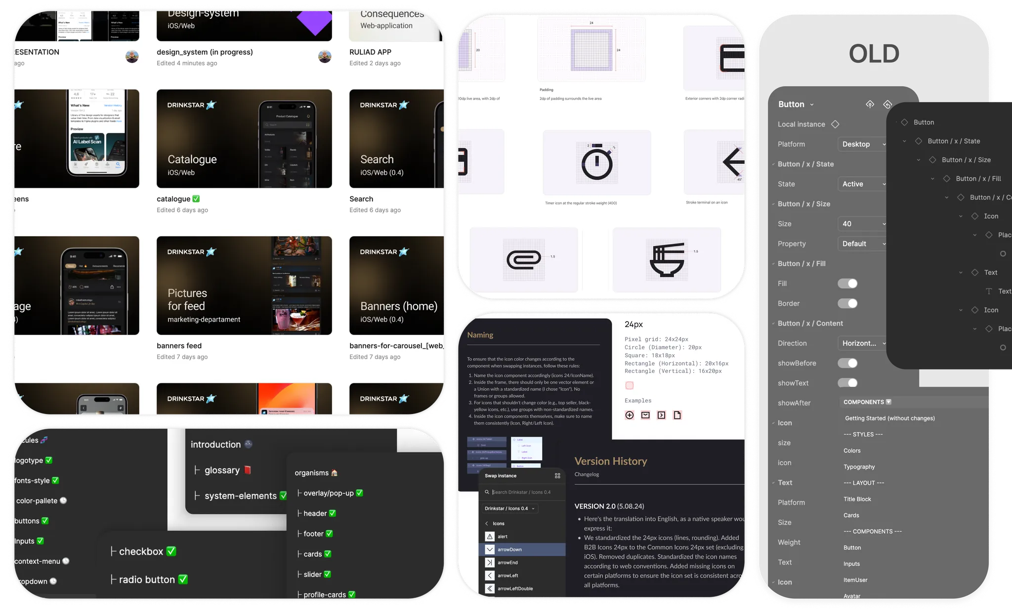
The file itself needed the same treatment as the components: a naming system that actually described what things were, fixed spacing and sizing standards instead of ad-hoc values, and properties organized so a dev could find the right variant without asking me first.
Communication with Developers
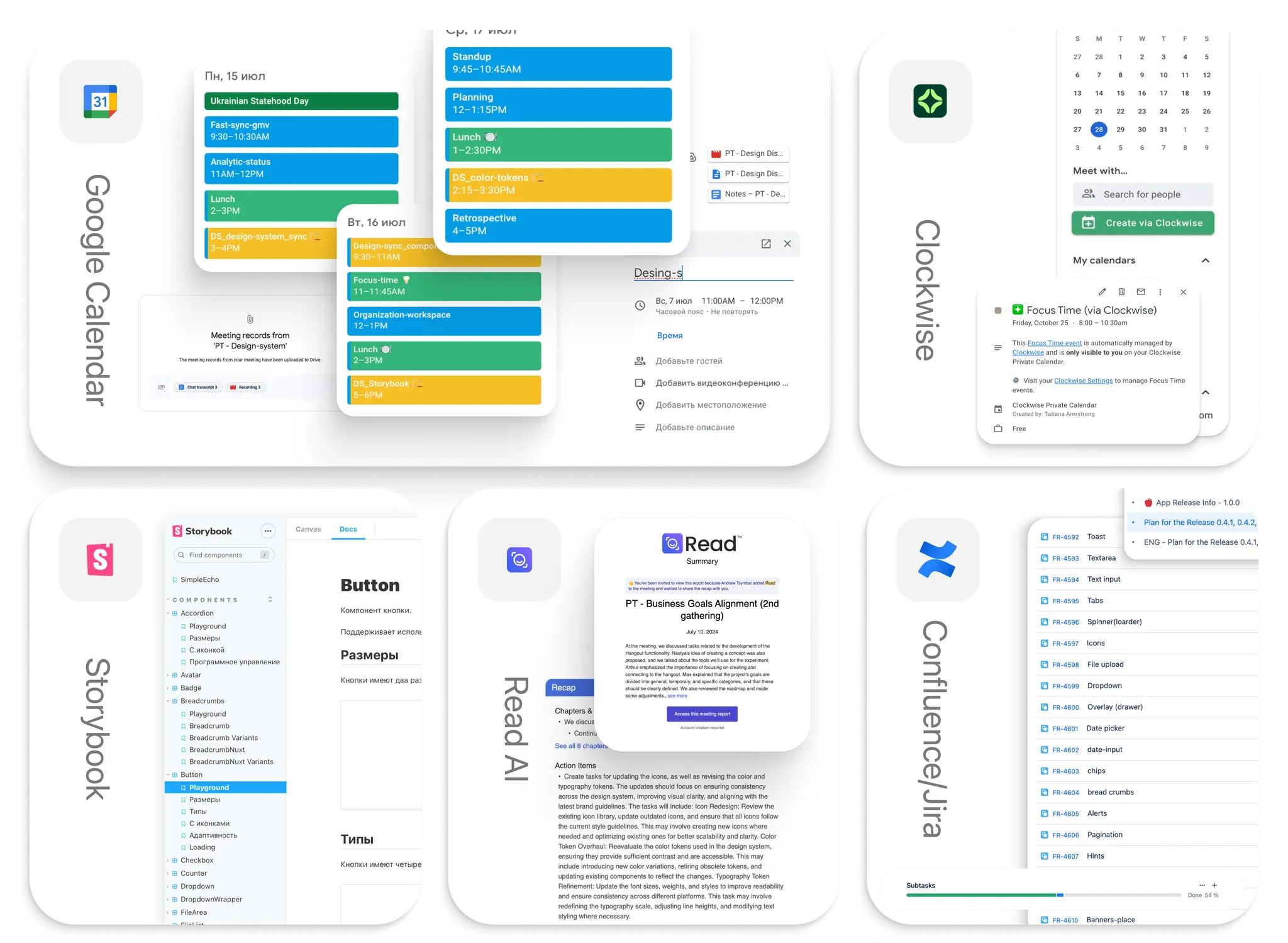
Every component shipped with Confluence docs - standard use, edge cases, implementation notes - written so a developer wouldn't need to ping me for the obvious questions.
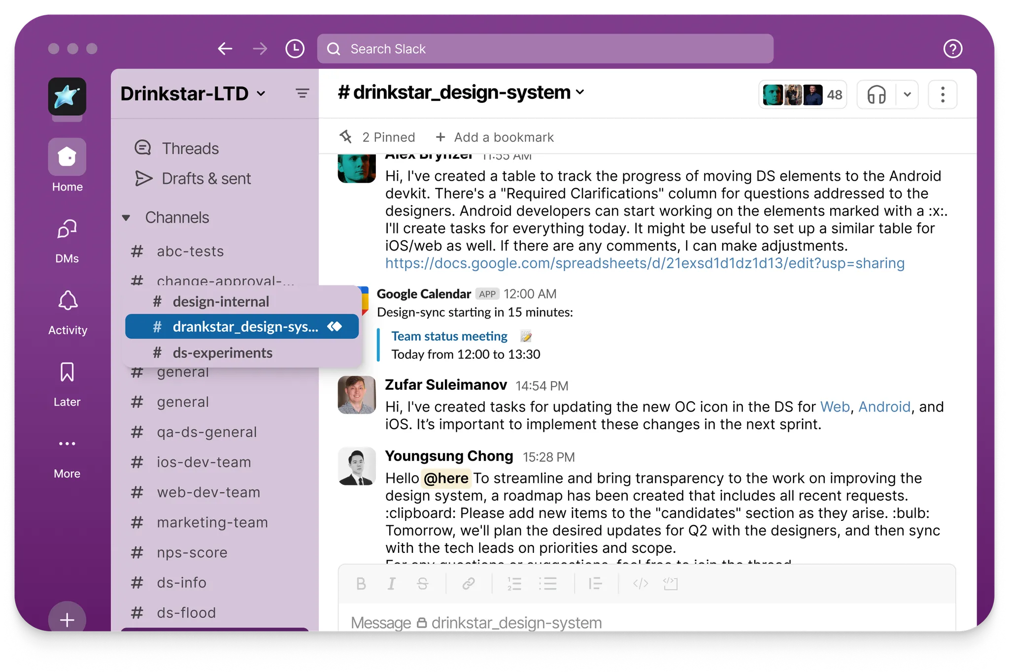
A dedicated Slack channel handled the non-obvious ones, plus regular syncs to catch drift between the design and what was actually getting built.
Final UI
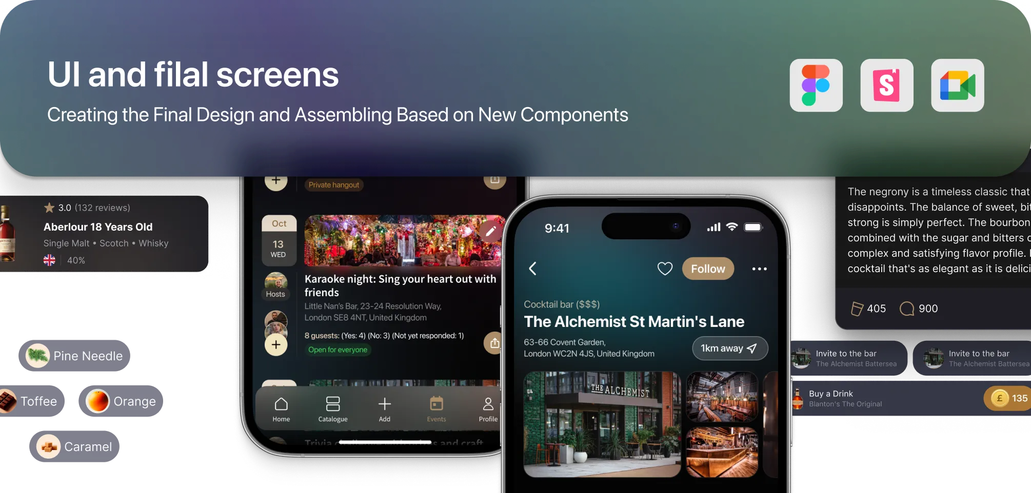
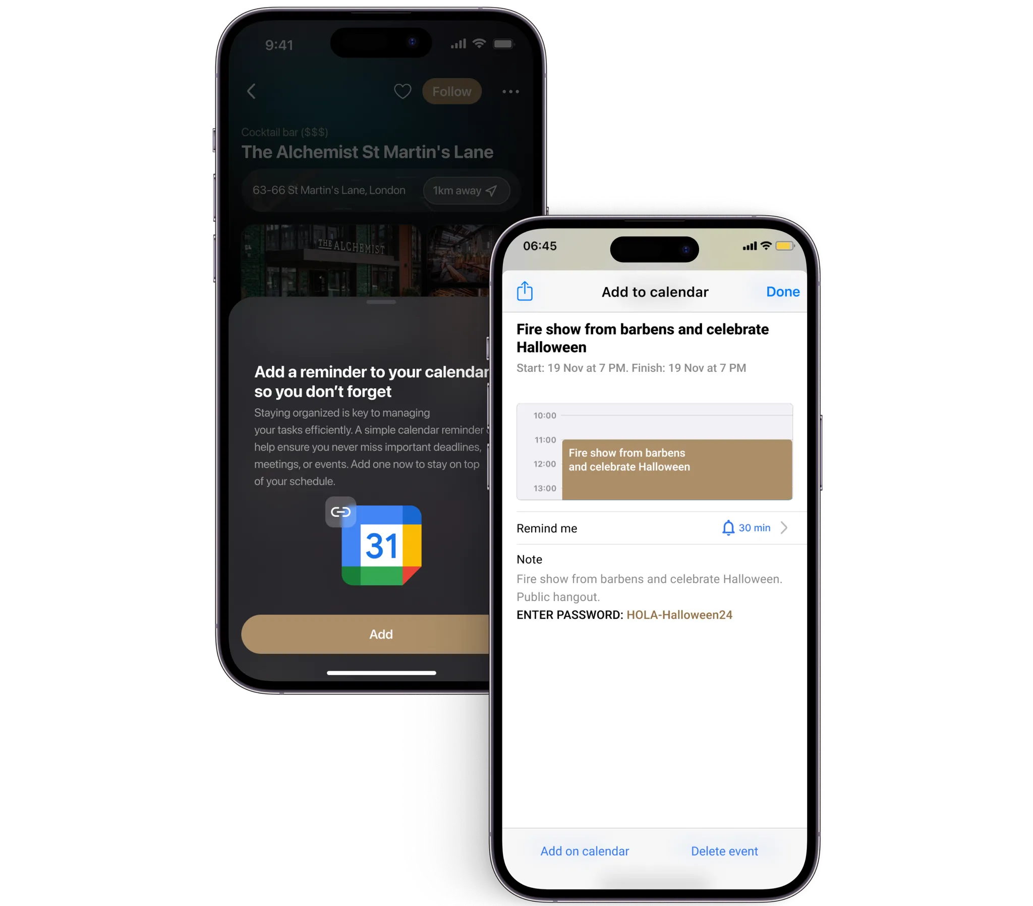
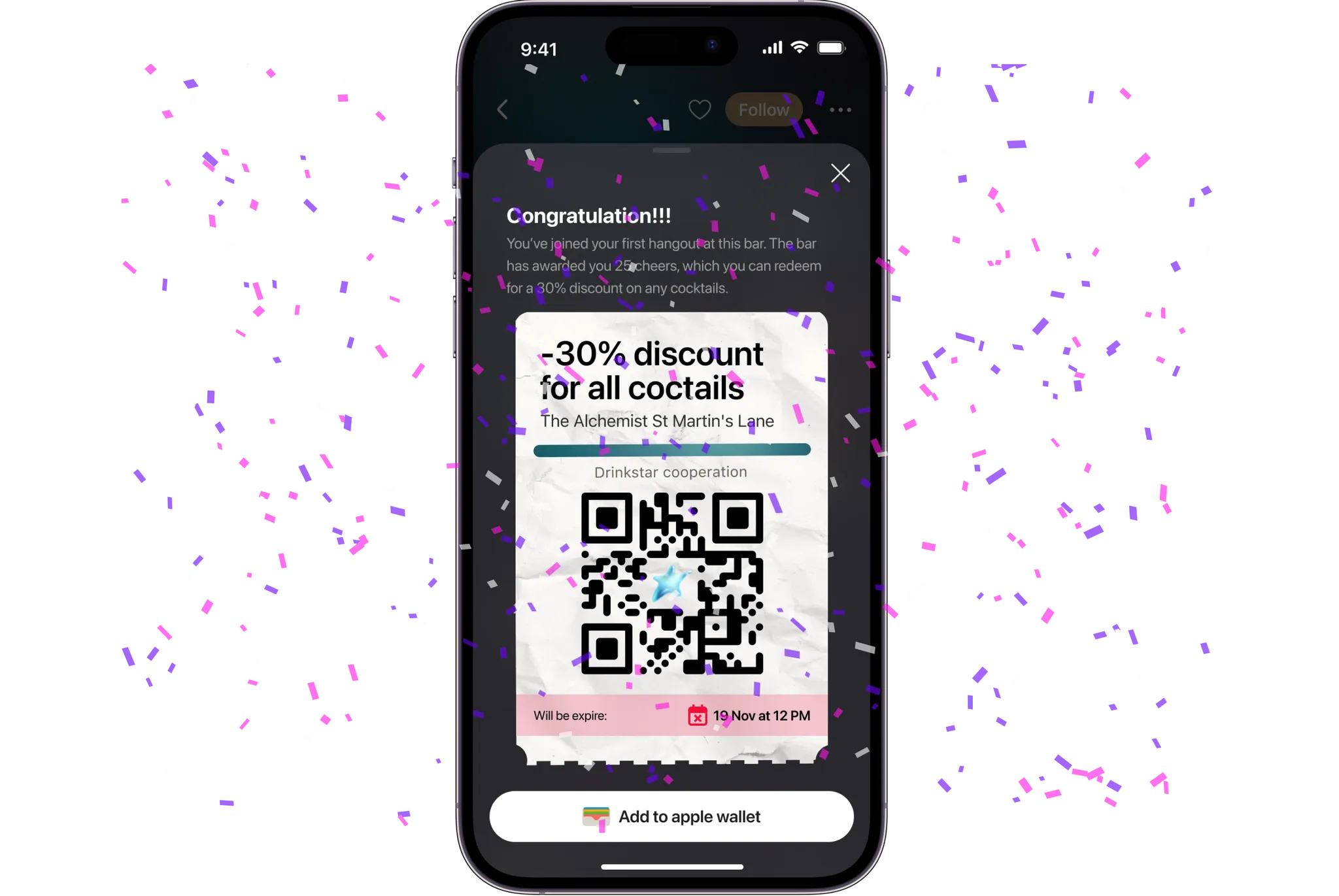
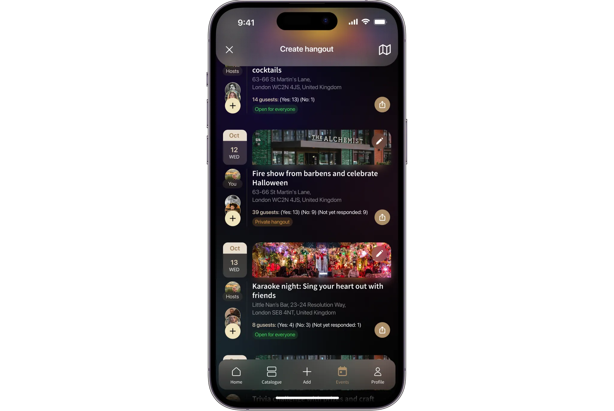
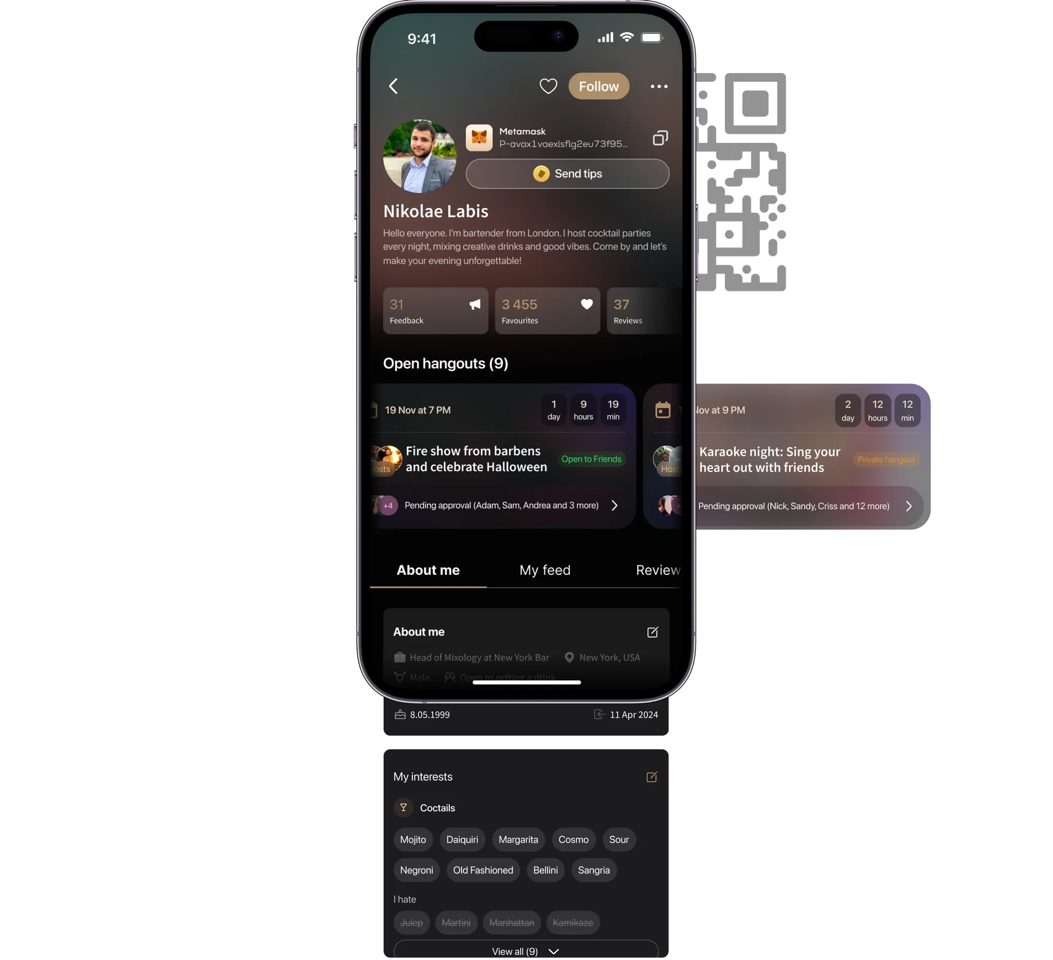
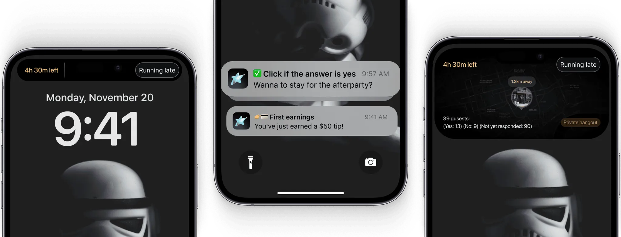
What shipped: fewer steps to create or join a hangout than the first prototype needed, a component library the dev team could actually build from without guessing, and a system built to take the product's own visual identity further instead of borrowing someone else's.
Plan & Product Improvements
Next, post-launch:

Metrics & Analytics
- Google Analytics + Hotjar for actual behavior: completion times, conversions, drop-off points.
- Data Studio and Tableau to keep those numbers visible, not buried in a spreadsheet nobody opens.
- A/B testing once there's a real baseline to test against.
- AI for the parts that genuinely need pattern-finding at scale - dataset analysis, personalization - not as a blanket label.